Advanced Typography / Task 2: Key Artwork & Collateral
3.5.2023 - 31.5.2023 / Week 5 - Week 9
Sylvia Lau / 0356130
Bachelor
of Design (Honours) in Creative Media
Task 2: Key Artwork &
Collateral
JUMP LINKS
Process
Final Submission
Reflection
Further Reading
LECTURES
Done in Task 1.
INSTRUCTIONS
Task 2A: Key Artwork
Week 5
In this task, we are required to create a key artwork, which is a wordmark or
lettering. We need to use our first name or pseudonym to create it.
Sketches

Figure 1.1 Sketches, Week 5 (1/5/2023)
While I was doing my sketches, I had no direction for creating my key
letters, and the sketches that I did doesn't really show my personality
according to the mib. I tried writing out my first name and thinking of how
to design them in a different way. But the process was very messy and I
think it is hard to make connection between each letter in my name. So, I
thought of using the first three letters and arranging them in a different
arrangement.
This is the final arrangement of my first three letters, I wanted to make
them connect with each other but also easily read. Then I tried sketching
with different strokes, curves, and some elements to it.

Figure 1.2 Mind Mapping, Week 5 (3/5/2023)
During the class, Mr. Vinod suggested us to do a mind map for this task to
understand ourselves and gain ideas. We need to create key letters that
represent ourselves. I did a simple mind map of myself about the nickname
that was given when I was in high school, the symbol of myself is
spectacles, things that I like, and personality.
Week 6

Figure 1.3 First Attempt Progression, Week 6 (8/5/2023)
Referring to my mindmap, I thought of applying music elements to my first
design of the sketch, not only that I like music, but my friend also gave
comments about the first design looking similar to music notes. I started to
digitalize the key letters and inserted some musical note elements, for
example, treble clef for the letter "s", base clef for the letter "y", and
parts at the end of the music sheet for letter "l". For the horizontal
stroke of "l", I tried using the tail of half quarter music
note.

Week 7
I restart my progression of working on my key letters by sketching different
ideas, but not much related to my personality. Based on my mind map, I wrote
myself as an introverted person, but actually I enjoy a lively atmosphere like
hanging out and having fun with close friends and family members. So, the aim
of the final idea is to make my key letters look fun.

Figure 1.5 Reference found from Pinterest, Week 7 (14/5/2023)

Figure 1.6 Sketch of the final idea, Week 7 (14/5/2023)

Figure 1.7 Third Attempt Progression, Week 7 (14/5/2023)
By doing so, I use shapes to present the alphabet. But I think is a little
plain with only black color shapes, so I decided to make them half in lines,
the other half in full form. I make them that way because my friends said that I was a very quiet and hard-to-approach person during our first met, but after hanging around for some time, they found me very active, which was like two different people.
So, the artwork represented me as a two personality when approaching different people.


The background was very plain, so I was thinking to add something for the background but not too much, which didn't catch too much attention from the key artwork. I did the animation using After Effects, by changing the scales, positions, and rotation of those letters and making a bounce effect on them.
For the first attempt, I only made bounce effects on the artwork, which is too simple and boring. To highlight the mark of my key artwork, I animated more of it, like bouncing from outside to its position.


Since there was still a lack of one post, I decided to post the repetition of
the symbol. I made a few attempts to see which background color match the
best. I liked the bottom left because the visuals didn't look too full and
packed into each other like the first column.

Figure 1.8 Continuous Progression, Week 7 (16/5/2023)
I continue with adding some elements, for example, the happy icon that
appears in comics and circles. And I also try different attempts of "y" and
"a". I remain the design of "Y", but the half circle on the letter "A" in
the previous design has been stretched, so I changed it to a triangle which
shows the "A" clearer. The strokes that I did are too much and thin, which
couldn't be seen when I zoomed out. I decrease the number of strokes and
increase the thickness of them.
During the class, Mr. Vinod guided us to complete some tasks. The first task
is to take a self-picture, and the next task is to create a color palette
using "Colour Hunt", with high, middle, and low tones but also has
contrast.

Figure 1.9 Self-profile, Week 7 (17/5/2023)

Figure 2.0 Color Palette, Week 7 (17/5/2023)
The reason for choosing this color palette is to represent that my inner side is a person who loves having fun but is very shy to approach people. Yellow will be my key artwork color to represent happiness and energetic, the background will be blue to show my introverted personality.

Figure 2.1 Adding Key Artwork to My Profile, Week 7 (17/5/2023)

Figure 2.2 Applying the color scheme to Key Artwork, Week 7 (17/5/2023)

Figure 2.3 Key Artwork + Profile, Week 7 (17/5/2023)
Week 8

Figure 2.4 Visual Identity Different Attempts, Week 8 (22/5/2023)
After knowing I need to expand my key artwork into a visual identity,
I remove all the additional elements and focus on the dot of the "i". I
decide to make the dot as a sun to show my personality that I love having
fun with people on my inner side, but not my appearance. Besides, the sun
can show a cheerful expression.

Figure 2.5 Final Key Artwork, Week 8 (22/5/2023)
I've removed the additional elements, so the focus point will be the sun.
The final key artwork will be the second because the sun also seems like a
flower.
Task 2B: Collateral
Week 8
Animation:
Figure 2.6 First Attempt Animated Key Artwork, Week 8 (22/5/2023)
The background was very plain, so I was thinking to add something for the background but not too much, which didn't catch too much attention from the key artwork. I did the animation using After Effects, by changing the scales, positions, and rotation of those letters and making a bounce effect on them.
Figure 2.7 Second Attempt Animated Kew Artwork, Week 8 (22/5/2023)
Items:
The products that I planned to do are washi tape, stickers, cards, and
shirt. But in other thought, the products that I listed are not related to
each other. So, I changed my plan to do a shirt, tote bag, hat, and phone
case. The products are usually what I've seen on online shopping
platforms. The purpose of choosing these accessories is to spread energetic feelings through wearing or taking them.

Figure 2.8 Plain Mock-up Template, Week 8 (23/5/2023)
I found some templates from Pinterest which available me to paste my design
on it. I also picked some images that have the color yellow.

Figure 2.9 Tote Bag, Week 8 (22/5/2023)
At first, I only think of pasting the sun on it, but it's too simple. Then,
I duplicated them and arranged them into a flower shape.

Figure 3.0 Sweater, Week 8 (22/5/2023)
By not repeating the same arrangement of visual identity, I decided to
arrange them randomly and added the replicate of it with a thinner stroke.

Figure 3.1 Phone Case, Week 8 (22/5/2023)
Since the posts that I have done so far consisted of lots of yellow and
white backgrounds only, I decided to have at least 3 or 4 posts with blue
backgrounds to balance the color on my Instagram page. For the phone case, I
reused the design that I did previously.

Figure 3.2 Hat, Week 8 (22/5/2023)
The few designs I did above don't apply my key letters, so I pasted them to
the hat. I tried adding the sun on the middle top, but I wanted to keep it
simple with just the letters.
Week 9
At this stage, I already have 4 product posts and 1 animated gif, I still
need to think of one more product, profile picture, and key artwork.

Figure 3.3 Cards, Week 9 (30/5/2023)

Figure 3.4 Re-do of the cards, Week 9 (30/5/2023)
I created four different designs for the cards, but the outcome is very
blurry. I refound a new template that was much clearer.

Figure 3.5 Profile Picture, Week 9 (30/5/2023)
I did my profile during the last class but just using key artwork, so I
would like to apply some color to it and changing the letters to visual
identity would be better.

Figure 3.6 Key Artwork, Week 9 (30/5/2023)
For the post of my key artwork, I tried different styles to design.

Figure 3.7 Patterns, Week 9 (30/5/2023)

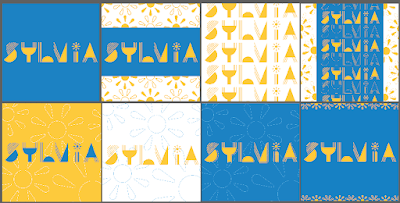
Figure 3.8 Instagram Page Layout, Week 9 (30/5/2023)
Before arranging the posts, I already had a plan to put my profile in the
middle, then surrounded by blue color background, but I only had three posts
with that color, so the top would arrange to yellow background. The four
corner posts will be in white or grey color. The size of these posts is not
1024 x 1024 px yet, just for testing.
Instagram Page:
After finishing my collateral, I created my Instagram account and posted all
nine posts on it.
Instagram Account Link: https://www.instagram.com/syl_via_lau/

Figure 3.9 First Attempt, Week 9 (30/5/2023)

Figure 4.0 Final Layout, Week 9 (30/5/2023)
I made some changes on the background of key artwork.

Figure 4.1 Rearrange the posts, Week 11 (14/6/2023)
Final Submission:

Figure 4.2 Final Submission of Task 2A, JPEG, Week 10 (7/6/2023)

Figure 4.3 Final Submission of Task 2B, Key Artwork, JPEG, Week 10 (7/6/2023)

Figure 4.4 Final Submission of Task 2B, Key Artwork, JPEG, Week 10 (7/6/2023)

Figure 4.5 Final Submission of Task 2B, Animated Key Artwork, GIF, Week 10 (7/6/2023)

Figure 4.6 Final Submission of Task 2B, Color Palette, JPEG, Week 10 (7/6/2023)

Figure 4.7 Final Submission of Task 2B, Visual Identity, JPEG, Week 10 (7/6/2023)

Figure 4.8 Final Submission of Task 2B, Collateral #1: Tote Bag,
JPEG, Week 10 (7/6/2023)

Figure 4.9 Final Submission of Task 2B, Collateral #2: Hat, JPEG, Week 10 (7/6/2023)

Figure 5.0 Final Submission of Task 2B, Profile, JPEG, Week 10 (7/6/2023)

Figure 5.1 Final Submission of Task 2B, Collateral #3 Sweater, JPEG, Week 10 (7/6/2023)
Figure 5.2 Final Submission of Task 2A and 2B (PDF), Week 10 (7/6/2023)
_page-0001.jpg)
Figure 5.3 Final Layout of Instagram Page, JPEG, Week 10 (7/6/2023)
Figure 5.4 Final Layout of Instagram Page (PDF), Week 10 (7/6/2023)
FEEDBACKS
Week 5
The artwork is symbolic, the word is readable, there is a good balance of strokes, there is no unnecessary non-objective elements, the elements match well with the letters.
Week 6
Suggest abandoning the monogram you have, just type out your name and try what you can do with that because this is not working.
Week 8
Independence Learning Week
Week 9
This is nice, but over-used the mark of the key artwork and not using the key artwork enough. You have not just made the mark to all some color, got some part highlighted and some part not highlighted, which create dimensional there. But the key artwork post with the use of the mark is not necessary.
Experience
I struggled sometimes to figure out how to create my key artwork because of
the limited time after getting feedback to redo it. I managed to get it done
and proceed to the next task which was to do collateral. I enjoyed creating my
own brand design in task 2b.
Observation
I need to explore and understand more about myself because when I'm doing the
task, it took some time for me to do a mindmap of myself and create a key
artwork that shows my personality. Besides, the use of color in brand design
is important, it is an important visual element in product visual communication.
Finding
Other than doing the task, exploring the work done by designers on websites,
Pentagram, or Pinterest is important, which provided me ideas and inspiration
to do my task better, although sometimes I easily got influenced by it, so I
need to remind myself not to follow it.

Figure 6.1 Book Cover
Book Title: Typographic Design: Form and Communication
Published by: John Wiley & Sons, Inc., Hoboken, New Jersey
Case Study: A typographic program for the 17th Street Farmer's Market
The 17th Street Farmers’ Market in the Shockoe Bottom district
of Richmond, Virginia, was one of America’s first public markets. In recent years, the market has thrived as a vital center for
community events, and as a venue for farmers, artists, flea and antique
dealers, and bakers to sell their products.

Figure 6.2 Poster designed by John Malinoski
John Malinoski was asked to design a poster for one of the
market’s events. The bold, vector-based tractor silhouette, simple spatial arrangement, and vibrant color are features that became the distinctive hallmarks of the market's graphic program in this poster. The silhouetted image of a farm tractor is used as the market's logo and as a key design feature on flyers, postcards, bumper stickers, and other printed products.
Malinoski’s work for the market is
also street savvy. People on foot and in cars are drawn to the posters and other materials due to their simplicity and boldness. The tractor frequently pairs with other pictures or text to pique visitors' interest.

Figure 6.3
In the poster on the left, a tractor hauls a giant
tomato to create a highly exaggerated and
memorable image. On the right, the wheel of a farm tractor is
substituted for the letter o in the word tomato, the large scale and oblique angle of the
type, and the hot color, set the stage for a hot
summer event.

Figure 6.4
The contrast between a wheelbarrow and type creates a convincing image. The wheelbarrow is filled with items found at the market.

Figure 6.5
Sometimes type and image come together in unexpected ways to communicate a story or a condensed narrative.
Poster on the left: The "Opening "refers to the
market’s new season
and the emergence of
a spring flower. The
typeface selected for the
word is both organic and
geometric, effectively
corresponding to the
flower.
Poster in the middle: In an
announcement for Saturday Arts on the Market, a living room setting
with a framed image of the tractor suggests that art was purchased at
the market.
Poster on the right: For a market event focused
on pets, a tractor is placed in a doghouse.
The inherent
simplicity of the graphic program belies the careful attention paid to
every conceivable typographic detail.


Comments
Post a Comment