Advanced Typography/ Task 1: Typographic Systems and Type & Play
5.4.2023 - 26.4.2023 / Week 1 - Week 4
Sylvia Lau / 0356130
Bachelor
of Design (Honours) in Creative Media
Task 1: Typographic Systems and
Type & Play
LECTURES
Lecture 1
Advanced Typography: Typographic Systems
There are eight major variations with an infinite number of permutations.
Figure 1.1 Axial System
All elements are organized to the left or right of a single axis.
Figure 1.2 Radial System
All elements are extended from a point of focus.
Figure 1.3 Dilatational System
All elements expand from a central point in a circular fashion.
Figure 1.4 Random System
Elements appear to have no specific pattern or relationship. Even though it's
random, there is a method in the chaos that is created within the page.
Figure 1.5 Grid System
A system of vertical and horizontal divisions.
Figure 1.6 Transitional System
An information system of layer banding.
Figure 1.7 Modular System
A series of non-objective elements that are constructed as a standardized
unit.
Figure 1.8 Bilateral System
All text is arranged symmetrically on a single axis.
Lecture 2
Advanced Typography: Typographic Composition
Principles of Design Composition
The dominant principles underpinning design composition are emphasis,
isolation, repetition, symmetry and asymmetry, alignment, and perspective to
name a few. However, these abstract notions seem ambiguous when it comes to
translating them into typographic layouts or compositions. They seem more
relevant to imagery than complex units of information that consist of
different elements.
Figure 2.1 Example of emphasis
Within a given space, it translates well in a layout.
The Rule of Third
Figure 2.2 Rule of Third
It is a photographic guide to composition. The intersecting lines are used as
a guide to place the points of interest, within the given space.
Figure 2.3 Example of applying Rule of Third
Realistically no one would use the Rule of Third in typography.
Typographic Systems
Of the 8 systems, the most pragmatic and the most used system is the Grid
System, which is derived from the grided compositional structure of Letter
Press Printing.
Figure 2.4 Grid System
Grid System may seem to be old, but the versatility of the system and its
modular nature tends to allow an infinite number of adaptations, so it
continues to remain popular.
Other Models / Systems
Environmental Grid
Figure 2.5 Example from Brenda McManus (Typographic Form and Communication)
This system is based on the exploration of an existing structure or numerous
structures combined. An extraction of crucial lines both curved and straight
is formed. The designer then organizes his information around this
super-structure, which includes non-objective elements to create a unique and
exciting mixture of texture and visual stimuli.
Form and Movement
This system is based on the exploration of existing Grid Systems. It is to get
students to explore the multitude of options the grid offer, to dispel the
seriousness surrounding the application of the grid system, and to see the
turning of pages in a book as a slowed-down animation in the form that
constitutes the placement of image, text, and color.
Figure 2.6 Example of Form and Movement
Static versions of the form are placed on the spread. Care was taken to ensure
visual connections and surprises on every page. The forms could represent
images, text, and color.
Figure 2.7
The level of complexity increases as newer elements are introduced in an
incremental fashion: the addition of one color, then images, then dummy text,
and so on.
Lecture 3
Advanced Typography: Context and Creativity
Handwriting
Handwriting is important in studying typography because the first mechanically
produced letterforms were designed to directly imitate handwriting.
Handwriting would become the basis or standard for form, spacing, and
conventions mechanical type would try and mimic.
Figure 3.1 Evolution of Latin Alphabets
The shape and line of hand-drawn letterforms are influenced by the tools and
materials used to make them. Sharpened bones, charcoal sticks, plant stems,
brushes, feathers, and steel pens all contributed to the unique
characteristics of the letterform.
Figure 3.2 Cuneiform (3000 B.C.E)
Cuneiform is the earliest writing system. Its distinctive wedge form was the
result of pressing the blunt end of a reed stylus into the wet clay tablets.
The cuneiform characters evolved pictograms.
Figure 3.3 Hieroglyphics (2613-2160 B.C.E)
The Egyptian writing system is a mixture of both rebus and phonetic characters
- the first link to a future alphabetic system. Hieroglyphic images have the
potential to be used in three different ways: ideograms, determinatives, and
phonograms.
Figure 3.4 Early Greek
Early Greek letters were drawn freehand, not constructed with compasses and
rule, and they had no serifs. In time, the strokes of these letters grew
thicker, the aperture lessened, and serif appeared. The new forms used for
inscriptions throughout the Greek empire served as models for formal lettering
in imperial Rome.
Figure 3.5 Roman Uncials
Roman letters were becoming more rounded, the curved form allowed for fewer
strokes and could be written faster.
Figure 3.6 English Half Uncials
In England, the uncial evolved into a more slanted and condensed form.
Figure 3.7 Carolingian Minuscule
It was used for all legal and literary works to unify communication between
the various regions of the expanding European empire. The Carolingian
minuscule was as important a development as the standard Roman capital - for
it was this style that became the pattern for Humanistic writing.
Figure 3.8 Black Letter
Blackletter is characterized by tight spacing and condensed lettering. Evenly
spaced verticals dominated the letterform. Condensing line spacing and letter
spacing reduced the amount of costly materials.
Figure 3.9 The Italian Renaissance
Humanists named the newly rediscovered letterform Antica. The Renaissance
analysis of form was applied to art and architecture was directed toward
letterforms.
Figure 3.1.1 Evolution of Middle Eastern Alphabets
While the Phoenician letter marks a turning point in written language, the use
of sound represented in letters, the script itself has been possibly
influenced by the Egyptian Hieroglyphics and Hieratic Scripts.
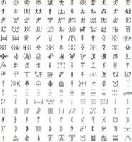
Figure 3.1.2 Oldest writing in the "Indian" subcontinent
The oldest writing found in the "Indian" subcontinent the Indus Valley
Civilization script, is as yet undeciphered and seems to have been somewhat
logo-syllabic in nature.
Figure 3.1.3 The Brahmi script
It is the earliest writing system developed in India after the Indus script.
All modern Indian scripts and several hundred scripts found in Southeast and
East Asia are derived from Brahmi.
Figure 3.1.4 Pallava
A South Indian script originally used for writing Sanskrit and Tamil. It was
highly influential, becoming the basis for writing systems across Southeast
Asia.
Figure 3.1.5 Jawi
The Arabic-based alphabet, when the traders engaged in missionary work, needed
to teach Jawi to people to read and write. This allowed it to spread among the
upper and middle classes.
Lecture 4
Advanced Typography: Designing Type
Figure 4.1 UNIVERS by Illustrator, Airport Signage using Frutiger
Frutiger is a sans serif typeface designed by the Swiss type designer Adrian
Frutiger in 1968. The goal of this typeface was to create a clean,
distinctive, and legible typeface that is easy to see from both close up and
far away. But there were limitations while designing the typeface, he tested
with unfocused letters to see which letterforms could still be identified.
Figure 4.2 Georgia, Verdana
Matthew Carter trained as a punchcutter, responsible for Crosfield's
typographic program in the early 1960s. Many of Carter's fonts were created to
address specific technical challenges, for example, those posed by early
computers, Verdana (1996) for Microsoft. The purpose of font was tuned to be
extremely legible even at very small sizes on the screen. The considerations
of Verdana fonts exhibit characteristics derived from the pixel rather than
the pen, brush, or chisel.
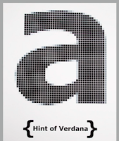
Figure 4.3 Hint of Verdana
Georgia and Verdana were hated by web designers because they were among the
few fonts they could use. But Georgia and Verdana also made an appearance in
print. In 2010, IKEA changed from Futura to Verdana.
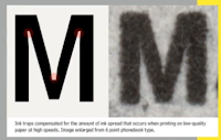
Figure 4.4 Comparison, font vs printed
In 1976, AT&T commissioned the design of a new typeface whose sole purpose
would be for use in their telephone directories. Matthew Carter designed Bell
Centennial which solve multiple technical and visual problems related to the
existing phonebook typeface.
Figure 4.5 Johnston Sans
Edward Johnston is the creator of the hugely influential London "Underground"
typeface, which knows as "Johnston Sans". He was asked to create a typeface
with "bold simplicity" that was truly modern yet rooted in tradition.
Johnston's design combined classical Roman proportions with humanist warmth.
Johnston's remit was to unite the London Underground Group. All the
advertising and signage were all different. He applied the proportions of
Roman capital letters to his typeface, so it was rooted in history and
traditional calligraphy. But it has an elegance and a simplicity that
absolutely fits the modern age.
Figure 4.6 Gill Sans
Gill Sans designed by Eric Gill, which he admitted had been heavily based on
Johnston's work.
General Process of Type Design
1. Research
When creating type, we should understand type history, type anatomy, and type
conventions. We should also know terminologies, side-bearing, metrics, and
hinting. It is also important to determine the type's purpose or what it would
be used for, and what different applications it will be used in. We should
also examine existing fonts for inspiration, ideas, reference, context and
etc.
2. Sketching
Some designers sketch their typeface using the traditional toolset because
they are more confident with their hands and have better control using it.
Some designers sketch their typeface using the digital toolset, but this can
sometimes impede the natural movement of hand strokes.
3. Digitalization
The leading software used in the digitalization of typefaces is Fontlab and
Glyphs. Some designers also used Illustrator to design or craft the
letterforms and then introduce them into the specialized font apps. Attention
should not only be given to the whole form at this stage but also to the
counter form.
4. Testing
The results of the testing are part of the process of refining and correcting
aspects of the typeface. The prototype is also part of the testing process and
leads to important feedback. However, it is not as crucial if the typeface is
a display type, where the expression of the form takes a little more
precedence.
5. Deploy
Even after deploying a completed typeface there are always teething problems
that did not come to the fore during the prototyping and testing phases. The
rigor of the testing is important so that the teething issue remains minor.
Typeface Construction
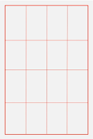
Figure 4.7 Construction grid for the Roman Capital
Using grids can facilitate the construction of letterforms and is a possible
method to build your letterform.
Construction and Considerations
Figure 4.8 Visual Correction
An important visual correction is the extrusion of curved forms past the
baseline and cap line. This also applies to vertical alignment between curved
and straight forms. A visual correction is also needed for the distance
between letters. It is not possible to simply place letters next to each other
with equal spacing between them.
Lecture 5
Advanced Typography: Perception & Organisation
Figure 5.1 Contrast created by Rudi Ruegg
It is important to create a contrast to create a distinction or
differentiation between information.
Carl Dair on the other hand adds two more principles into the mix; texture and
direction. Dair posits 7 kinds of contrast:
1. Size
Figure 5.2 Examples
A contrast of size provides a point to which the reader's attention is drawn.
The most common use of size is in making a title or heading noticeably bigger
than the body text.
2. Weight
Figure 5.3 Examples
Weight describes how bold type can stand out in the middle of the lighter type
of the same styles. Using rules, spots, and squares also provides a "heavy
area" for a powerful point of visual attraction.
3. Form
Figure 5.4 Examples
It is the distinction between a capital letter and its lowercase equivalent,
or a Roman letter and its italic variant, condensed and expanded versions of
the typeface are also included under the contrast of form.
4. Structure
Figure 5.5 Examples
It means the different letterforms of different kinds of typefaces. For
example, a monoline san serif and a traditional serif, or an italic and a
blackletter.
5. Texture
Figure 5.6 Examples
Texture refers to the way the lines of type look as a whole up close and from
a distance. This depends partly on the letterforms themselves and partly on
how they're arranged.
6. Direction
Figure 5.7 Examples
Contrast of direction is the opposition between vertical and horizontal, and
the angles in between. Turning one word on its side can have a dramatic effect
on a layout. Mixing wide blocks of long lines with tall columns of short lines
can also create a contrast.
7. Color
Figure 5.8 Examples
The use of color is suggested that a second color is often less emphatic in
values than plain black or white. It is important to give thought to which
element needs to be emphasized.
Form
Figure 5.9 Examples of Form
The form is important because it creates the most visual impact when looking
at the context. A good form of typography tends to be visually intriguing to
the eye; it leads the eye from point to point, entertains the mind, and is
most often memorable.
Typography can be seen as having two functions, which are to represent a
concept and to do so in a visual form.
Figure 5.10 Examples of simple letters present in delicate
Displaying type as a form provides a sense of letterforms' unique
characteristics and abstract presentation.
Organisation / Gestalt
Gestalt theory emphasizes that the whole of anything is greater than its part.
Therefore in design, the components or elements that make up the design are
only as good as its overall visual form. While each component may be
functional at an elemental level, the sum of its parts is not greater than the
whole or the overall form.
Figure 5.11 The Law of Similarity
It is the gestalt grouping law that states elements that are similar to each
other tend to be perceived as a unified group. Similarity can refer to any
number of features, including colors, size, or indeed motion.
Figure 5.12 The Law of Proximity
This law states that items close to each other tend to be grouped together,
whereas items further apart are less likely to be grouped together.
Figure 5.13 The Law of Closure
It refers to the mind's tendency to see complete figures or forms even if the
picture is incomplete.
Figure 5.14 The Law of Continuation
This law holds that humans tend to perceive each of two or more objects as a
different, singular, and uninterrupted object even when they intersect.
Figure 5.15 The Law of Symmetry
It is a visual property in which elements are made up of equivalent parts to
resemble proportion and balance.
Figure 5.16 Law of Pragnanz
The law of Pragnanz says humans prefer experiences and stimuli that are simple
and orderly. But it also means that we'll infer meaning and create connections
in the objects we see.
INSTRUCTIONS
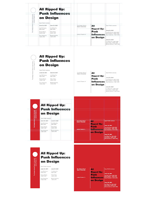
Task 1: Exercise 1 - Typographic Systems
For this exercise, we need to explore 8 systems which are Axial, Radial,
Dilatational, Random, Grid, Modular, Transitional and Bilateral by using the
content given. We were also required to watch the lecture and demonstration
video. The exploration of various systems will be using InDesign, size 200 x
200mm, can use one other color than black and graphic elements can be used
limitedly.
Week 1 & 2
Figure 1.1 Axial System Attempts, Week 1 (5/4/2023)
From what I understand of this system, I need to have an axis line for this
design and arrange the information given on the line. After recapping using
InDesign, I decided to try it in a vertical way and a slightly tilted way. I
planned to use Univers LT Std because the title gives me a bold and
uninhibited feeling, so I increased the size of the title a lot to express
it. By balancing the huge text on the left, I arranged some long pieces of
information on the right. I put the background color on the left side to
highlight the title.
Font Used:
Left: Univers LT Std (Black, Bold, Roman)
Right: Univers LT Std (Extra Oblique Black, Bold, Roman)
Figure 1.2 Radial System Attempts, Week 1 (7/4/2023)
For the first attempt, I created some lines from different angles to guide
me in inserting the text. At first, I didn't try to add too many lines
because I thought it would be messy, but I found that there were some empty
spaces at the top and bottom right. Then, I tried inserting more lines and
rearranging the text and title to utilize every space as much as possible. I
also increased the stroke of the title and added color to make it clear to
the reader.
Font used:
Left: Univers LT Std (Extra Black, Bold, Roman)
Right: Univers LT Std (Black, Bold, Roman)
Figure 1.3 Dilatational System Attempts, Week 1 (8/4/2023)
I think this system is very challenging to me, as it's hard to accurately
indicate that the distance between each circle is the same. For the first
attempt, I planned to break the title into two parts and connect them
through two circles, the information would be placed in the inner part of
the circle. But the space inside the circles is not fully utilized, and I
felt that if the information is divided into four lines, it creates a
strange visual effect on the full circle. So I tried another attempt which
is likely a quarter circle.
Font used:
Left: Univers LT Std (Extra Black, Bold, Roman)
Right: Univers LT Std (Black Oblique, Bold, Roman)
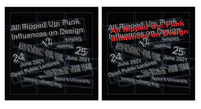
Figure 1.4 Random System Attempts, Week 1 (8/4/2023)
Firstly, I just put all the content without any arrangement at the bottom
which looks like the text collapsed. For the second attempt, I randomly put
all the text together again, and I don't think the reader could read it, so
my idea is to allow them to read even in the midst of chaotic text.
Font used:
Left: Univers LT Std (Roman)
Right: Univers LT Std (Bold, Roman)
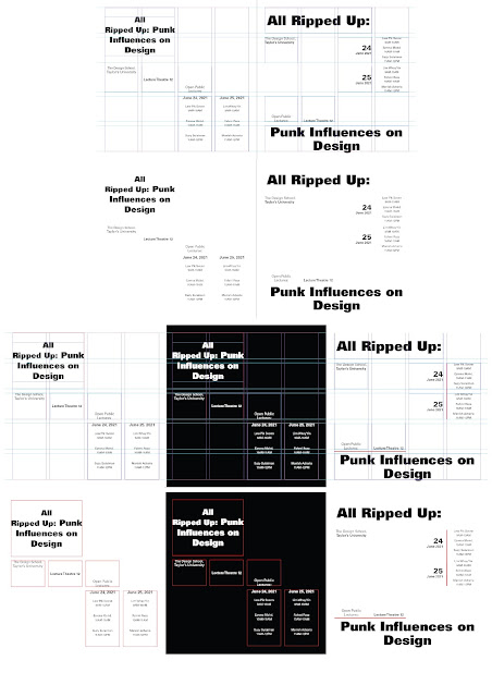
Figure 1.5 Grid System Attempts, Week 2 (10/4/2023)
Before starting this system, I didn't understand the difference between a
grid and a modular system. After doing some reading and comparing some
examples, I have a direction for doing it. From the two attempts, I arranged
the text in a very boring way, I fit all of the text to the width of the
column to make it neat. For the first attempt, I tried to make some of the
text vertical and apply color to the whole column so the viewer would notice
the text.
Font used:
Left: Univers LT Std ( Extra Black, Bold, Roman)
Right: Univers LT Std ( Extra Black, Bold, Roman)
Figure 1.6 Transitional System Attempts, Week 2 (10/4/2023)
I didn't have much ideas about doing this system, so I tried playing the
text in different compositions and making the text not aligned? The first
attempt came out to be very ugly and with unnecessary spaces in the
middle. For the second attempt, I created five rows, in which the second
row would be the title and short information, and the second and third
rows would be placed with longer information. I arranged the text bleed
off of the left or right so it somehow has a reading flow from it.
Font used:
Left: Univers LT Std ( Bold Extended, Extended)
Right: Univers LT Std ( Bold, Roman)
Figure 1.7 Modular System Attempts, Week 2 (11/4/2023)
Font used:
Left: Univers LT Std ( Extra Black, Bold, Roman)
Right: Univers LT Std ( Extra Black, Bold, Roman)
Figure 1.8 Bilateral System Attempts, Week 2 (11/4/2023)
With my understanding of this system, I placed the text in a straight line.
For the first attempt, I placed them in the middle, and for the next
attempt, I tried to place them on the left or right.
Font used:
Left: Univers LT Std ( Extra Black, Bold, Roman)
Right: Univers LT Std ( Black, Bold, Roman)
Week 2
Figure 2.1 Axial System Refined, Week 2 (14/4/2023)
I applied a baseline grid so that I knew the actual spaces between the text
and it looked neater.
Figure 2.2 Radial System Refined, Week 2 (14/4/2023)
I didn't do many changes to this. I just reduced the size of the circle so
that it won't be too eye-catching.
Figure 2.3 Dilatational System Refined, Week 2 (14/4/2023)
I made the text at the outer circle bold because it looked more texture,
compared to using the same font style at the in and out circle.
Figure 2.4 Random System Third Attempt, Week 2 ( 14/4/2023)
I tried to do another attempt at this system because the previous attempts
didn't seem random enough and had many empty spaces. I simply rearranged the
content and duplicated it to create some blurry effect. By letting the title
more specific, I made the title red, I also tried to add red text to some
important information, but it didn't come out well.
Figure 2.5 Transitional System Refined, Week 2 (14/4/2023)
I created some rows as a guide to arrange my text. I'm gonna stick with
the style that I did for the title, but the spaces would be wider to fill
up the spaces.
Figure 2.6 Grid System Refined, Week 2 (14/4/2023)
I applied a baseline grid to align the text better and with consistent space
between them. After having more understanding of this system, I make sure
that the text fits the column without exceeding it.
Figure 2.7 Modular System Refined, Week 2 (14/4/2023)
In my previous attempt at this system, I think it was not very clear to show
that was a modular system. So I increased the text size to let the text fit
in its own units.
Figure 2.8 Bilateral System Refined, Week 2 (14/4/2023)
Final Submission:
Figure 3.1 Axial System Final Submission, Week 2 (15/4/2023)
Figure 3.2 Radial System Final Submission, Week 2 (15/4/2023)
Figure 3.3 Dilatational System Final Submission, Week 2 (15/4/2023)
Figure 3.4 Random System Final Submission, Week 2 (15/4/2023)
Figure 3.5 Grid System Final Submission, Week 2 (15/4/2023)
Figure 3.6 Transitional System Final Submission, Week 2 (15/4/2023)
Figure 3.7 Modular System Final Submission, Week 2 (15/4/2023)
Figure 3.8 Bilateral System Final Submission, Week 2 (15/4/2023)
Figure 3.9 Typographic Systems Final Submission, Week 2 (15/4/2023)
Figure 3.1.1 Typographic Systems Final Submission with guides, Week 2
(15/4/2023)
Task 1: Exercise 2 - Type & Play
Week 3
For the next exercise, we were required to select an image of an object,
structure, or something from nature, then extracted the letters from it using
Illustrator. Extracted letterforms go from crude representation to a more
refined expression while maintaining the core features of their origin. We
also need a sample font for direction and reference when refining.
Figure 4.1 French Fries, Week 3 (17/4/2023)
I took this image for this exercise because I could easily see some letters
from it and I think it would be easy to extract the letters.
Figure 4.2 Extracted Letters, Week 3 (18/4/2023)
I extracted five letters from the image by reducing the opacity of it. The
letters are " Y, T, A, E, X."
Figure 4.3 Progress of Refinement, Week 3 (18/4/2023)
After extracting the letters, I adjusted the strokes of some letters and
arranged them more neatly. The sample font that I found for reference typeface
was Acme Regular. From the letters that I did, the strokes didn't look
consistent, so I picked one of the vertical and horizontal strokes to apply to
all of the vertical and horizontal strokes.
Figure 4.4 Progress of three-dimensionality in letters, Week 3 (19/4/2023)
After being given feedback, I tried three-dimensionality in my letters. I
traced out the square part and shading part of the french fries and applied
them to the letters. I was not sure whether I could put a color for the
shading, so I just made the lines white so it could be seen.
Task 1: Exercise 2 - Type & Image
Week 4
Upon completing the letterforms, I continued with combining the letters into a
related image and integrated the letters. The poster size would be 1024x1024
pixels.
Figure 5.1 Related Images, Week 4 ( 24/4/2023)
Since the text that I did was about french fries, the poster will be related
to french fries. My first idea for the poster will be frying oil as the
background and the text will be floating at the surface. The next idea will be
just french fries as background. I decided to go with the second image, as the
first image is not very suitable for what I expected it to be and I couldn't
find any more images related to the frying oil background.
Figure 5.2 First Attempt, Week 4 (24/4/2023)
I put the word in a very simple way, like a title at the top of the
image.
Figure 5.3 Second Attempt, Week 4 (24/4/2023)
I realized the french fries in the image were a little messy, so I thought of
putting my text more random and leaving a little gap in each stroke. I also
added Gaussian Blur for the text to make it more like french fries in the
image. But the results still came out weird, whether in black or white filled.
I was thinking of putting color for the text but I wasn't sure if it allowed
or not.
Figure 5.4 Third Attempt Progress, Week 4 (26/4/2023)
Figure 5.5 Third Attempt, Week 4 (26/4/2023)
After receiving feedback, I applied color to it by using gradient filled. Mr.
Vinod also suggested I add some dripped sauce to the text like the
image.
Week 7
The work is almost done now, but I needed to add logos that are related to the
poster. So, the logos that I found are about fast food that has french fries
like Mcdonalds', KFC, and Burger King. I searched for the black and white
logos and image traced them in Illustrator.
Figure 5.7 Final Attempt, Week 7 (17/5/2023)
Mr. Vinod told me to change the color of the logos to red and move the date
downward.
Final Submission:
Figure 6.1 Type and Play "Y" Final Submission, Week 5 (1/5/2023)
Figure 6.2 Type and Play "A" Final Submission, Week 5 (1/5/2023)
Figure 6.3 Type and Play "E" Final Submission, Week 5 (1/5/2023)
Figure 6.4 Type and Play Final "T" Submission, Week 5 (1/5/2023)
Figure 6.5 Type and Play "X" Final Submission, Week 5 (1/5/2023)
Figure 6.6 Type and Play Final Submission, Week 5 (1/5/2023)
Figure 6.7 Type and Image Final Submission, Week 5 (1/5/2023)
Figure 6.8 Type and Image Final Submission, Week 5 (1/5/2023)
FEEDBACK
Week 1:
Both work very well. The one on the right is pretty cool, which starts off very big and moves on to the right, kinda balances off the big text, then back again to the left, and ends it small. It's not completely symmetrical, there is dynamism. Expression with a little more detail will be great.
Week 2:
Axial System- the space between the text can be consistent.
Random System- can be more randomized, the space at the middle is too empty.
Transitional System- the text below is not transitional.
Week 3:
There is three-dimensionality to the french fries, so it is something that might want to consider. Extraction is fairly good and the results at the end are also relatively good. The beginning and the end of the stroke are good, can apply one of the vertical and horizontal strokes for all of the vertical and horizontal strokes. Don't lose the organicness of the shape. Maybe in some refinement process, can introduce three dimensionality in it. You are on the right track.
Week 4:
The thickness of the inner strokes should be thicker, but let's assume you go with it. The use of it, with the choice of black is not making any sense. Can add the sauce onto the letterforms as well, depending on how you try to integrate this, trying to create an interplay between the subject matter and all the images and letterforms.
REFLECTION
Experience
Throughout the first exercise, I played around with the text with different
compositions which actually took a lot of time to try out and it was somehow
hard for me to complete all of them in a week's time. For the second
exercise, I had fun doing it, because it didn't have many requirements, and
I can explore my surroundings to extract some letters from the
objects.
Observation
I have a clearer understanding of the eight typographic systems, and this
exercise also helps to refresh my memory on using Adobe InDesign.
Finding
I still find it hard to explain my design and the reasons why I designed it
that way. But doing some readings might help me with the explanation and
phrases used.
FURTHER READING
Book Title: Typographic Systems Book
Published by: Kimberley Elam
Constraints and Options
Within any project process, there are typographic constraints and options
that provide opportunities for rich yet subtle variations. All lines of a
message must be used in each composition. However, lines may be broken at
will to change a single line into multiple lines, creating changes in
grouping and the way in which the line is read. Leading is variable, which
in turn creates changes in position and textures. Variable word spacing and
letter spacing created distinct changes in texture and tone.
Figure 7.2 Line Breaks
The longest line must be broken in order to more fluidly compose the
message. (left) Once broken, the lines of text can be readily moved within
the format (middle), and logically grouped (right).
Figure 7.3 Leading
During the beginning phases of the project, leading is often determined by
the default values of the computer (left). As work progresses, the designer
experiments with grouping lines of text and altering the leading between
lines (middle). As sensitivity develops, the designer carefully plans and
organizes leading, word spacing, and letter spacing (right).
The Circle and Composition
Figure 7.4 Different Placements
The circle, particularly in the restrained one-size, one-weight
compositions, gives the designer a tool to guide the eyes; create a pivot
point, tension, and emphasis; or contribute to the visual organization or
balance.
Figure 7.5 Different Placement
When a designer finishes the thumbnail series of compositions, he or she
is encouraged to develop yet another series with the strongest
composition, moving only the circle. The next step is to evaluate the
results. As a result, the designer realizes how a small element can
completely change a composition and how is read.
Nonobjective Elements
The nonobjective elements enhance the functions of emphasis, organization,
and balance. It becomes a functional guide when used with typography and
communicates the message more clearly by enhancing a hierarchical order
and directing the viewer's eye. It also can strengthen a message by
communicating a sense of organization and direction.
Figure 7.6 Rule Series (Top), Circle Series (Middle), Tone Series (Bottom)
Rule Series: When there is a change in weight, the rules also create a
rhythm and guide the eye downward. Altering the length of the rules
creates a strong diagonal. Changes in rule weight create a hierarchy by
guiding the eye to the largest volume of black.
Circle Series: Circle can act as a nonobjective pivot point or as an
element that creates a hierarchy. The examples show ways in which the
circle draws the eye to a single word, making that word the first read in
the composition.
Tone Series: The eye is drawn to the largest volume of black on a white
background or the largest volume of white on a black background. Words or
options of words can be emphasized, giving the message a sense of visual
punctuation.
















.jpg)
.jpg)
.jpg)
.jpg)
.jpg)
.jpg)
.jpg)
.jpg)


Comments
Post a Comment