Interactive Design: Exercises
3.4.2023 - 26.4.2023 / Week 1 - Week 8
Sylvia Lau (0356130)
Bachelor of Design (Hons) in Creative Media
Interactive Design / Exercises


Sylvia Lau (0356130)
Bachelor of Design (Hons) in Creative Media
Interactive Design / Exercises
INSTRUCTION
Week 1
Mr. Shamsul briefed us on the information booklet and assessment throughout
this semester.
Exercise 1: Website Analysis
Our first assigned exercise is to do a report on two chosen websites from
the link given. Review the website, taking note of its design, layout, content, and
functionality. Identify the strengths and weaknesses of the
website, and consider how they impact the user experience. Write a brief report summarizing your findings and
recommendations.
What To Have in The Analysis:
What To Have in The Analysis:
- Consider the purpose and goals of the website, and evaluate whether they are effectively communicated to the user.
- Evaluate the visual design and layout of the website, including its use of color, typography, and imagery.
- Consider the functionality and usability of the website, including its navigation, forms, and interactive elements.
- Evaluate the quality and relevance of the website's content, including its accuracy, clarity, and organization.
- Consider the website's performance, load times, responsiveness, and compatibility with different devices and browsers.
Submission:
Exercise 2: Replicate Websites
Week 2
For the next exercise, we are required to replicate two existing websites
from the link given to gain a better understanding of their
structure. Follow the dimension of the existing website from the width and height. This exercise will help you develop your design skills using software
such as Photoshop or Adobe Illustrator, and gain insights into web
design best practices. You can use any image from stock image or free
stock icon. The image that you will be using does not have to be an
exact image. You may replace it with a similar image. Focus on the
layout, type style, and color style. To find similar typefaces/fonts,
you can download fonts from Google Fonts.
The website that I decided to replicate is Morgan Stanley | Global
Leader in Financial Services. I screengrab the landing page and placed
them in Illustrator, at the same time lower the opacity of these images
which made me easier to replicate.

Figure 1.1 Listed screengrabs of the landing page

Figure 1.2 Progression
The fonts that I found in Google Fonts which are quite similar to the
website are PT Sans, Anuphan, Inria Sans, Candara, and Karla. I
applied PT Sans for titles, Candara for the text at the navigation
bar, and Anuphan for subtitles.
For images, I can download them from the website, I also applied a
thin layer of gradient as the website image consisted of some black at
the bottom to make a contrast with the text color.

Figure 1.3 Progression

Figure 1.4 Progression

Figure 1.5 Progression
I drew out the squares and lines, placed the images accordingly, and
typed out the text using the fonts I downloaded.

Figure 1.6 Icons
For the social media icons, I traced the Twitter and Facebook icons by
using pen tool, for the other icons I used shape tool to draw them
out.
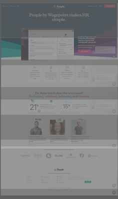
The second website that I chose is People by Wagepoint Software for
small businesses. I took a screengrab of the website landing page and
pasted it to Illustrator, the same as the steps that I did in the
first one.

Figure 2.1 Listed Screengrab of the landing page

Figure 2.2 First Landing Page
This website consists of San Serif and Serif typefaces, so it took
me some time to find suitable text for it. The fonts that I used for
the logo are Myriad Variable Concept and Futura Std. The font for
the navigation bar, I used Myriad Pro, and for the "try for free"
button, I used Anuphan. The other rest of the text is Serif, I used
STIX Two Text.
For the website background, I traced out the shape of the color and
applied them to the according color.

Figure 2.3 Progression
I used the pen tool to draw out all the icons at the upper and
middle parts accordingly. For the logos at the bottom part, I also
used a pen tool to trace them as I couldn't find any related logos
images on the Internet.

Figure 2.4 Progression
I found the logo of Loungebuddy, Du Claw Brewing Co., Sterling Bay
on the Internet, so I could just download the image and place it.
But for the other rest of the logos, I had to trace them, especially
the Pazos Law Group, which took some time for me did it.
Final Submission:

Figure 3.1 Website Replication 1

Figure 3.2 Website Replication 2
HTML Exercise 3: Personal Profile Page
Week 7
After completing Project 1, we started to learn coding. It started
with a basic exercise about HTML. In this exercise, we will
create a personal profile page using HTML. The goal of this exercise
is to help us practice our HTML skills and create a webpage that
showcases our personal interests.
Instructions:
- Think about what you want to include on your profile page. You should include your name, a photo, a brief bio, and some personal interests.
-
- Use HTML tags to structure your content. You should use headings (h1, h2, etc.) and paragraphs (p) to make your content more readable.
-
- Add lists (ul or ol) to showcase your personal interests. For example, you could create a list of your favorite books, movies, or hobbies.
-
- Add links (a) to your profile page. You could link to your social media profiles or to other websites that you find interesting.
-
- Include an image (img) on your profile page. This could be a picture of yourself or something that represents your interests.
I typed out the content to a doc that I wanted to include on my
profile page. The content was a short introduction about me and my
interest, I also included the shows that I liked recently.
Website Outcome:

Figure 4.1
I started with an h1 title and an h2 subtitle. Then before
introducing myself, I added a picture of me and I put a small
description below using italic.

Figure 4.2
After the introduction, the next part would be my personal
interest. From the tutorial video provided, I learned to create a
layout using bullet points and make the words linked to another
website. I thought of adding images to this part but the size of
the images was not consistent, and it came out as a mess, so I
gave up to apply them.
Final Submission:
Exercise 4: Layout Exercise
Week 8
After being familiar with the HTML code, the next stage was to
create a layout using CSS code. Mr. Shamsul did a tutorial video
for us to learn about CSS.

Figure 5.1 Images
Based on the content provided (text and images), the task is to
create a responsive grid layout for a website. The design and
alignment should be visually appealing and functional across
different screen sizes, allowing for optimal viewing on both
desktop and mobile devices.
Layout Outcome:

Figure 5.2
From the tutorial, I learned about using containers. It was my first time typing CSS code, so it was quite challenging for me, so without making too many mistakes, I followed the layout created in the video. On the header part, the texts on the nav bar were in the middle of the box, but after applying the logo, the texts had been moved and I couldn't figure it out to solve this problem.
I continued with the next part. Before applying the image, I edited the image to a dimmer appearance in Photoshop because I was thinking to put text on it. After struggling for some time, I decided to type the text below the image.

Figure 5.3
Moving on to the next part, I created a box to separate the section. In the box, I decided to do a layout of the image on the left and the content on the right. In the document, there was a sentence calling users to download, but I changed it to a button that allowed them easier to see where to click. I also learned how to apply the hover effect on the button.

Figure 5.4
I decided to do this layout because, in my Project 1, I had a section that had the same layout. So, I thought it would be better for me to start figuring out how to type it in code. I faced some problems while doing it, but I managed to solve them and achieve the outcome I wanted.

Figure 5.5
In my first attempt, I created two boxes and entered the text in them, because I wanted to try different layouts. But during the consultation, I was told that I must include every image provided, so I ended up placing the image on top of the boxes.
Figure 5.6
Lastly was the footer, I copied the code that was done on the header as it was similar, and I just changed the text of it.
The feedback that I got was some of the section lack of responsiveness. I followed the guides provided and made changes to it. Most of them had been settled but for the images in the third and fourth sections, the images were not responsive in different devices. After adjusting many times, I just gonna let them be like that since it was not too obvious. I decided to submit it because the deadline was near and I needed to start with Project 2.
Final Submission:


Comments
Post a Comment