Information Design: Exercises
11.1.2023 - 22.1.2023 / Week 1 - Week 2
Sylvia Lau (0356130)
Bachelor of Design (Hons) in Creative Media
Information Design - Exercises


Sylvia Lau (0356130)
Bachelor of Design (Hons) in Creative Media
Information Design - Exercises
INSTRUCTION
Week 1
Group Task:
We were required to find out the different types of infographics, the kind of
information they are applicable for, and an example for each identified type
in our group.
We did some group discussions and each prepared one type of infographic. I
found some information about Hierarchical Infographics which visualize content
that goes from smallest to biggest or more important to least important, for
example, food pyramid, family tree, and population pyramid.
Slides: Different Types of Infographics
Individual Task:
I needed to pick one online infographic tool and re-design one poorly
constructed infographic poster through my own experimentation with the
selected tool.
Poorly constructed infographic:

Figure 1.1 Infographic found from Google
- From the image above, the arrangement of information made the reader hard to understand and took a lot of time to read it.
- The information of the timeline should not be expressed in a circle, but as a timeline infographic, because it shows the historical development of social media usage.
- It breaks down all the data and confuses the reader, for example, the year of the outer circle is not connected to the year of the inner circle.
- The PieChart in the middle may mislead viewers into thinking that it is social media usage.
- The icons should indicate what the pattern represents because some readers will not know what the icons represent to which social media.
Reference:

Figure 1.2 Reference from Venngage
Re-design infographic:

Figure 1.3 Re-design Infographic
Exercise 1: Quantify & visualize data
In this exercise, we were required to collect some similar content like
buttons, candies, or coins, to arrange them with relevant indicators
written out with pens to help us visualize the quantity and data.

Figure 2.1 Lego
Since I only found lego at home, I just used it. Among these piles of
legos, there were different kinds of shapes and patterns. To make it
easier, I chose some lego shape which was more repeated and in different
colours.

Figure 2.2 Arrangement
After separating different lego plates, I started to plan how to arrange
them on paper. I tried to arrange them in a horizontal style, but it was
too general. So, I tried to arrange them in a circle, and according to
their shapes and amount, arranged them in different patterns.

Figure 2.3 Final Outcome
After finishing the arrangement, I wrote the type of lego plates, the
number of different colours of lego pieces, and the total number of each
lego plate.
Week 2
Group Task:
During this week, we needed to present an explanation on the topic of
"Saul Wurman's L.A.T.C.H", and provide examples or scenarios of what
information is best utilized with each principle.
We did some research on different parts and created our own L.A.T.C.H.
example.
Slides: L.A.T.C.H
Exercise 2: L.A.T.C.H
We were required to organize a group of information into a visual poster
that combined and utilized the LATCH principles, a minimum of 4
principles. The poster size resolution would be 1240 x 1750 pixels or 2048
x 2048 pixels. There were a few suggested compiled data I could use, but
since I was not familiar with Pokemon or Dinosaurs, so I chose Genshin as
my topic.
Genshin has many characters with different elemental skills, for example,
pyro, electro, cryo, hydro, etc. I listed the character names in
categories.

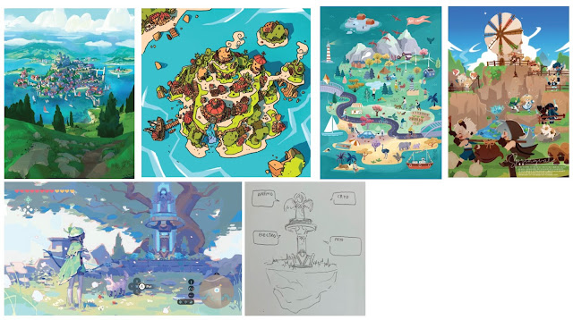
Figure 3.1 References
Since there are 4 main cities in Genshin, I picked Monstadt as my
background and the characters from there. I collected some references
for drawing the map, but I found it hard to draw it very detail. So, I
chose some iconic buildings or statues to represent the
place.

Figure 3.2 Character Reference

Figure 3.3 Character Sketch

Figure 3.4 Coloured Character

Figure 3.5 Categorized
As there're too many characters, I would just choose two characters for
each elemental skill because the space was a bit limited. According to
the character reference, I finished my character drawing and categorized
them into different boxes with logos.

Figure 3.6 Windmill

Figure 3.7 Background
For background, I thought of drawing a windmill because it is also the
scenery that represents Mondstadt, surrounded by trees and blue sky.

Figure 3.8 Final Outcome
Reflection
It was indeed a fun and interesting course for me because while doing the exercises given, I get to create any artwork that I wanted. For example, in exercise 2, I can choose any topic and draw whatever I like without limitation. During the first two weeks, I also got to learn some principles, know more about infographics, and how to create a good infographic. Besides, my team also get to know each other more while doing the group work and preparing for presentations.


Comments
Post a Comment