Typography/ Task 2: Typographic Exploration and Communication
30.9.2022 - 21.10.2022 / Week 5 - Week 8
Sylvia Lau (0356130)
Bachelor of Design (Honours) in Creative Media
Task 2 / Typographic Exploration and Communication


 Figure 2.2 Different Headlines using InDesign 7/10/2022 ( week 6)


 Figure 6.1 Second Attempt 10/10/2022 ( week 7)

 Figure 7.1 Third Attempted 11/10/2022 ( week 7)


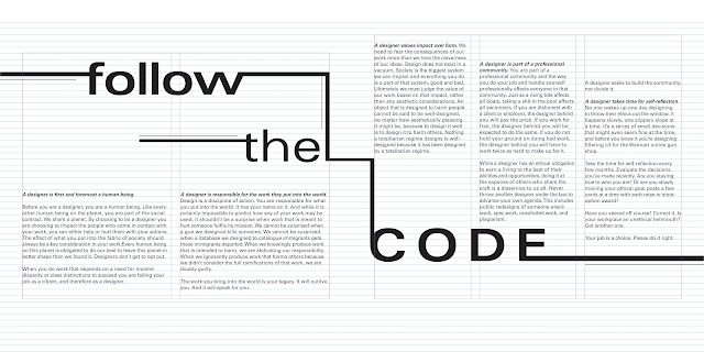


Figure 10.2 Multicolumn Grid
Sylvia Lau (0356130)
Bachelor of Design (Honours) in Creative Media
Task 2 / Typographic Exploration and Communication
LECTURE
Before we started our task, we are required to watch a video about the process demo of task 2. In this video, we are told to do a thumbnail sketch. If we need some tools to do type expression of headline, can use Illustrator then export to InDesign.

Figure 1 Demo of doing 2 pages in 1 spread
After putting headline and body text, we are recommended to cover them with patches, so that can see the division between the white areas and the grey area.
INSTRUCTION
Task 2: Typographic Exploration and Communication
In this task, we were given three text option to express typographically the content.
Week 6:
Sketches

Figure 1.1 Sketches of Head Text 5/10/2022 ( week 6)
I tried to sketch out some designs of the headline " Follow the Code". I decided to express the word follow by adding some arrows, lines or footprints that point and lead to the code.

Figure 1.2 Sketches of Layout 5/10/2022 ( week 6)
I also drew some thumbnail sketches of the layout before I started my work in InDesign.
Digitalized:

Figure 2.1 Different Headlines using Illustrator 7/10/2022 ( week 6)

I used Illustrator to design my headline initially, but when I export to InDesign it became a little blur. So I just done my headlines in InDesign.

Figure 3 Before and After text formatting 8/10/2022 ( week 6)
I started to do my layout according to the thumbnail sketch since some of my classmates gave feedbacks that the layout looked quite okay. I adjusted the font, font size, paragraphing, leading, and did the ragging and kerning of the body text.

Figure 4.1 First Attempt 8/10/2022 ( week 6)
I tried to do a layout that was given feedbacks in InDesign because I couldn't see how it really presented in my sketch. I putted some arrows pointing to the "code" which developed the message to follow the code.

Figure 4.2 Layout 1 8/10/2022 ( week 6)
Typefaces:
Headline: Univers LT Std 65 Bold, Univers LT Std 45 light, Univers LT Std 53 Extended
Body text: Bembo Std Extra Bold Italic, Bembo Std Regular
Size:
Headline: 52pt, 35pt, 72pt
Body text: 9pt
Leading: 11pt
Paragraphing: 11pt
Line Length: 58-67 letters
Week 7:
After listening to the feedbacks given last week and doing the first attempted layout, I think it was not very good so I decided to try a new headline. I found some image that gave me inspiration on doing the headline expression.

Figure 5 Inspiration of the headline 10/10/2022 ( week 7)
I connected the lines from follow to code, which I hope that can develop the message by letting the viewers to follow the line to the "code".

According to the image that I found on Pinterest, I made the width of the line same as the width of the letters and connected the line to the "code". I reused the layout from week 6, since the arrows had been removed so by filling the empty spaces, I placed the word "code" there.
I recreate the word "code" as the right side of the figure above, because I wanted to put lines like the word "follow". With that arrangement, I could easily connect the line.

Figure 6.2 Layout 2 10/10/2022 ( week 7)
Typefaces:
Headline: Univers LT Std 63 Bold Extended, Univers LT Std 53 Extended
Body text: Bembo Std Extra Bold Italic, Bembo Std Regular
Size:
Size:
Headline: 72pt
Body text: 9pt
Leading: 11pt
Leading: 11pt
Paragraphing: 11pt
Line Length: 58-67 letters

I tried the word "code" in a horizontal way as the white space on the left and right of the word were empty. I also changed it to three column because the letters had occupied the second column. At first the layout of second page was quite formal, so I arranged it like stairs which follow the flow of the word and line below.

Figure 7.2 Layout 4 11/10/2022 ( week 7)
Typefaces:
Headline: Univers LT Std 63 Bold Extended, Univers LT Std 53 Extended
Body text: Bembo Std Extra Bold Italic, Bembo Std Regular
Size:
Size:
Headline: 72pt
Body text: 9pt
Leading: 11pt
Leading: 11pt
Paragraphing: 11pt
Line Length:
First page: 58-67 letters
Second page: 38-46 letters
Week 8:
I suddenly remembered not to use two typefaces in one layout, so I changed the typeface of body text and redo the kerning, ragging, paragraphing, font size.

Figure 8 Layout 5 19/10/2022 ( week 8)
Typefaces:
Headline: Univers LT Std 63 Bold Extended, Univers LT Std 53 Extended
Body text: Univers LT Std 65 Bold Oblique, Univers LT Std 55 Roman
Size:
Headline: 72pt
Body text: 8pt
Leading: 10pt
Leading: 10pt
Paragraphing: 10pt
Line Length:
First page: 55-62 letters
Second page: 35-43 letters
Final Submission
Figure 9.1 Final Submission with baseline (pdf) 19/10/2022 ( week 8)
Figure 9.2 Final Submission (pdf) 19/10/2022 ( week 8)

Figure 9.3 Final Submission with baseline (jpg) 19/10/2022 ( week 8)

Figure 9.4 Final Submission (jpg) 19/10/2022 ( week 8)
FEEDBACK
Week 6
Specific Feedbacks: (Feedbacks given based on my sketches)Image is not allowed in this task, so second sketch is not available. The arrow might lead the reader to a wrong direction and the "follow" is not really develop the message to follow, it just leads to the code. The arrows is too much and too thick, maybe can decrease the width or correct it to the same width as the letters. The body text layout seems okay.
Week 7
No feedbacks given based on this task.
REFLECTION
Experience
I think it was quite challenging because I need to do the type expression of headline and create a layout at the same time. I also felt it was interesting while trying different layouts to make it not too "safe".
Observations
I found out that I still need to put more time to find more idea about the type expression of headline and layouts to make it more better. I also found that doing three columns in the layout was hard because the ragging is hard to control.
Findings
From this task, I am more familiar using InDesign to do text formatting.
FURTHER READING

Figure 10.1 Book Cover
Book Title: Typographic Design: Form and Communication
Published by: John Wiley & Sons, Inc. , Hoboken, New Jersey
Before any decision can be made about the construction of the typographic grid, must first become thoroughly accquainted with the amount of text, its content, the audience for which it is intended. Multicolumn grids possess unique anatomical characteristics. These horizontal divisions of space aid the designer in aligning text elements from column to column.
To structure type is to organize typographic forms into a unified whole, and to establish visual pathways between them. Two columns or many columns can be employed depending upon the complexity of the content.


Comments
Post a Comment